
IGEO DX
There And Back Again - Revelations in Visual & Gameplay Design
As the majority of IGEO DX's gameplay design has been implemented, the primary focus of development will be shifting into bolstering and refining the visual design. As a fairly strict puzzle game, I have always tried to maintain a very reserved and minimal but consistent design for IGEO.
That being said, I haven't always felt good about the game's artistic direction. Before arriving where it is today, I took the original IGEO through several design iterations. Most of the gameplay mechanics and concepts that arose from those attempts at building upon the game have made their way into DX. However, I had this lingering feeling that the game needed to look different.
From 'where' did we come back?
The fist "redesign" was a game I had re-dubbed Combinus. Structurally, it retained the minimalist, abstract design paradigm of IGEO but introduced materials and texture to help visually represent the new Shape mechanics. It was arguably more refined, opting for more earthtones and soothing contrast.
During Combinus' early development I was just not impressed with the visual appeal. It was too simplistic and bright. The game would remain in this state, unfinished for quite some time before I attempted once again to revive it - this time, taking the design to a universe of its own.
In early 2019, Combinus had now transformed into a far more ambitious concept of becoming a narrative-driven puzzle game known as Temples of IGEO. The game would retain the same gameplay mechanics and challenge but I would wrap it in a more grounded and "Earthy" aesthetic. Players would even take the role of a human, who I called Pakka.
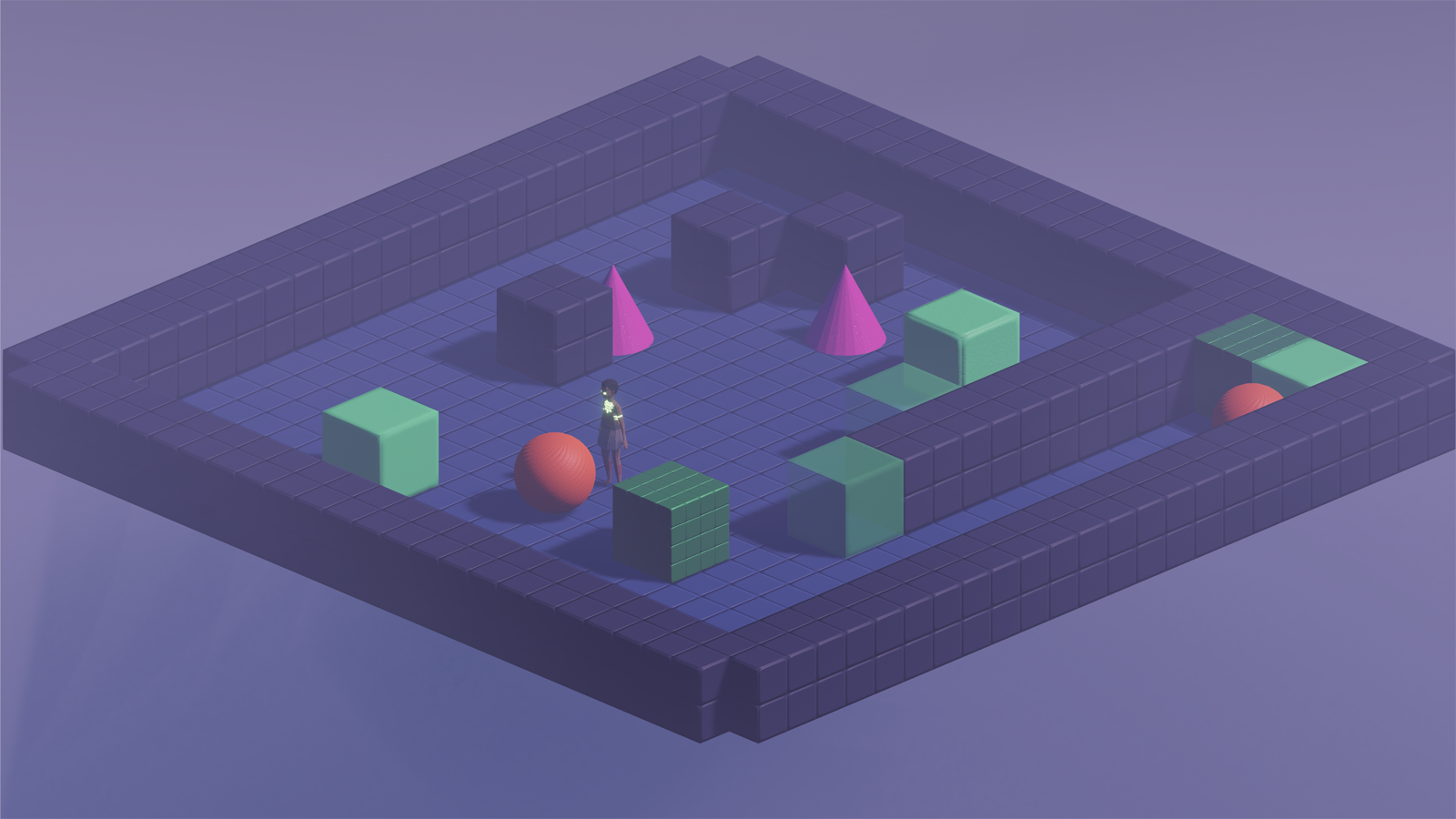
In going through this overwhelming transformation, I started to get a better understanding of what was more important for a game like this - not just an appealing visual design, but a solid cohesive one. With the mechanics I was adding to the game the need for more visual distinction was increasing. While the idea of having thematic levels with more realistic texture and ambiance sounded fun (and still does in a lot of ways) it was not consistent with the design of the game. I was risking making the spatial and visual reasoning required to master the game take a sidestep to making the game pretty.
Between that and where we are now, I jumped around to several different color schemes and visual treatments - but ultimately, in the end, I settled back into what worked the first time. Simple. Minimal. Abstract. Symbolic.
In puzzle game design (or really any game, for that matter) there is a balance that needs to be struck between engaging visuals and functional visuals. We've all played a game that was visually awe-inspiring but struggled to convey information to us quickly. We've also played amazing games that managed to convey so little with so much visual elements. Thus, the need for that balance.
Therefore, in my mind, IGEO DX needed to retain the simplicity of its predecessor. However, it also needed to improve upon its use of abstract design to not only make the game function better but look a little snazzier, too.
Going back to IGEO's roots
My first order of business was polishing up the game's general aesthetic. And I did literally just that. I refined the logo by giving it more depth and glossiness and took that look into the game's overall look and feel.
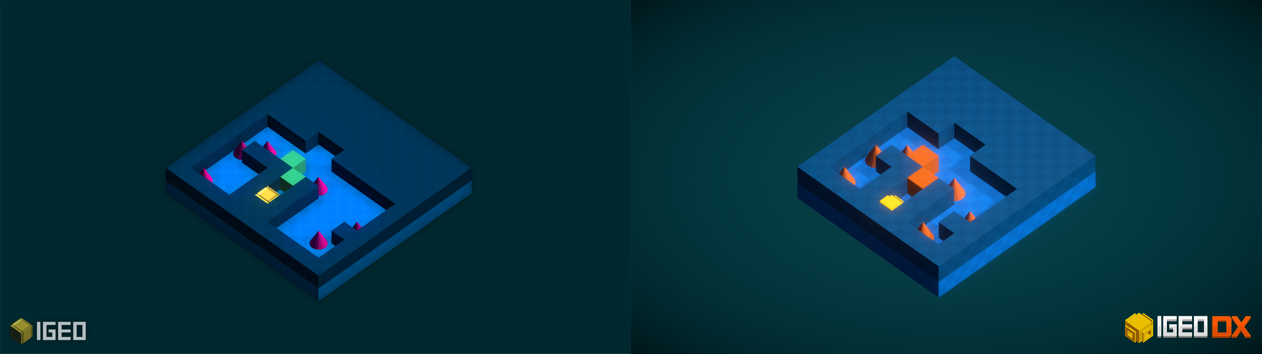
Side by side, you can see just how the visuals compare and contrast. IGEO DX is definitely brighter, bolder, and more refined looking - the lesson I retained from Combinus. The two levels shown here are basically identical in their gameplay and solution (the one in DX is a little smaller), but they convey functional information differently.
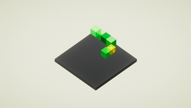
One of the first visual hurdles I ran into when beginning to add Shape States to the game was how to best illustrate them. These mechanics came about during the creation of Combinus and as such there was a strong attention put on the material nature of these states. Heavy shapes were metallic, light shapes were translucent, and stone (which would become glass) was rough and crumbled as you pushed it.
However, in IGEO, each shape had its own color and in Combinus they retained those colors across states. As I implemented this in IGEO DX, it just didn't look good. There was too much going on visually and the colors were becoming muddled. It was easy to tell what shape was what, but the states made things a little more difficult to quickly pick up on. There was just not enough visual distinction.
As the difficulty ramps in the game the sheer variance in the amount of shapes and puzzle elements on the screen increases, making for the potential for information overload. In order to keep the game accessible and functional, a striking or too realistic visual approach would not work.
Given that, I decided that state would determine the color appearance of shapes.
The primary reason for this was simplicity - only four distinct color cues for knowing a shape's state. A shapes function is easily distinguished by its...well...shape. This approach actually came with some other blessings, as well:
- Now that we were no longer married to a color per shape, it was easier to conform the colors to an inherently colorblind friendly scheme
- It would free up some of the visual color space for the newer additions to the game like switches and sliding tiles
Nothing like killing three birds with one stone, eh? I was able to keep the aesthetic consistent and functional, make it more accessible, and scale-able with a really simple method. It may seem counter-intuitive but it took taking the design in two polar opposite directions for me to come to terms with the proper approach for a game like IGEO DX.
You may be thinking, however, is that necessarily true for any game?
The answer is yes, in my opinion. The parameters may be different and the weight of visual and gameplay elements may vary - but the goal is still the same. Striking a balance between visual and gameplay design (except in the more experimental settings) is what truly gives a game balance. What good are mind blowing visuals if the gameplay is confusing or erratic? And what good is exciting gameplay if it can't be conveyed visually very effectively?
This isn't to besmirch retro graphics or to juxtapose simpler graphics to more advance ones (IGEO DX is 90% comprised of cubes, for goodness sake). That's not the argument. It is the design implications of using any one visual design alongside the game's mechanical design.
As a design approach
We see implications like this in diegetic design, where abstract UI elements or mundane activities are replaced by functional or realistic representations in the game world (like the health bar on Isaac's suit in Dead Space). Game's that favor this meshed method of visual and gameplay design thrive on immersion and simulation.
Inversely, grand strategy and some classic RPGs need to convey lots of information and large numbers in an easily digestible fashion. Employing a diegetic approach in that case could prove ineffective. But these are just shallow and one-off examples. Diegetic and abstract design elements can be and often are married together well - it just depends on what a game needs!
If there is a mantra or take-away here, it is this: mechanics should derive from visuals in the way visuals derive from mechanics.
This cohesion is what makes some of our industry's most storied creations. This balance, sadly, can be misconstrued and it is important as designers and developers that we try to recognize when that takes form.
For IGEO DX, it was Combinus and Temples of IGEO. I thought I could elevate IGEO's gameplay mechanics with a better aesthetic. The reality for this game was different. The gameplay was elevated when I realized approachability and functionality are its primary appeal - and that its visual design should work to bolster that. While I am just now beginning to refine and polish the art implemented in the game, this refreshed view of its design has made the process that much easier to maintain - almost as if all the pieces are falling into place.
Of course, this balance is difficult. I am artistic and a decent enough graphic designer but I haven't always focused my game development time on art and visual tools. Within the need to make IGEO DX more visually functional and appealing, I also needed to be able to actually do it. This, more especially for solo and teeny indie devs, makes this a design and practical consideration.
When you don't have the money or the skill set to make the most cutting-edge visuals, it is important to remember that taking this balanced approach will make up the difference. There are exceptions where the bleeding edge is needed for gameplay - but the reality is they are few and far between for the majority of developers.
Even with placeholder or programmer art, this approach of meshing gameplay and visuals will allow your game to communicate more effectively and that could strengthen your ability to pitch it for artists and level designers. Designing a game this way is not a one-size-fits-all perfect solution. It takes time and iteration to get the full grasp on how to best visually represent your gameplay.
For IGEO DX, the importance was set on communicating functionality. This was due to the large volume of interactions that can take place and needing distinct visuals to represent them. If I went too far off the deep end with particle effects and textures, the most important elements that the game uses to teach and challenge players could have been lost. There is still some work to do - I want the game to feel a little more lively and I am working to bring some variety to the game's visuals without distorting the consistent approach I've ended up with.
The end all be all is balance. With IGEO DX, taking this approach made for an effective and practical way to getting the game to look and feel the way I wanted it. While there is more refining and pop to be added in the coming months of development, the base look and feel is set and I'm liking how it is coming together!
Leave a comment
Log in with itch.io to leave a comment.